Homebuyers face a significant design choice when selecting color palettes for cabinetry, countertops, flooring, and tiling—features that shape a home’s look and feel for years to come. Natalia Kwasnicki, partner at Portico Design Group, shares insights on why most buyers lean toward lighter schemes and offers tips on making the right choice for lasting style and functionality. —Noa Nichol
What factors do you recommend homebuyers consider first when deciding between a light or dark color palette for permanent features?
When choosing between a light or dark color palette for your home, I encourage buyers to consider three key factors:
- Natural Light: How much natural light does the space receive? A light-filled room can handle a darker palette, while a space with limited natural light might benefit from a lighter, brighter scheme.
- Existing Furnishings: Consider the tone and color of your current furniture. Do you have warm wood tones or cool-toned upholstery? Choose a palette that complements your existing pieces.
- Desired Vibe: What kind of atmosphere do you want to create? Light palettes often evoke a sense of airiness and tranquility, while darker palettes can feel more sophisticated and intimate.
Why do you think light color schemes are trending among new homeowners, and how do they impact the feel of a space?
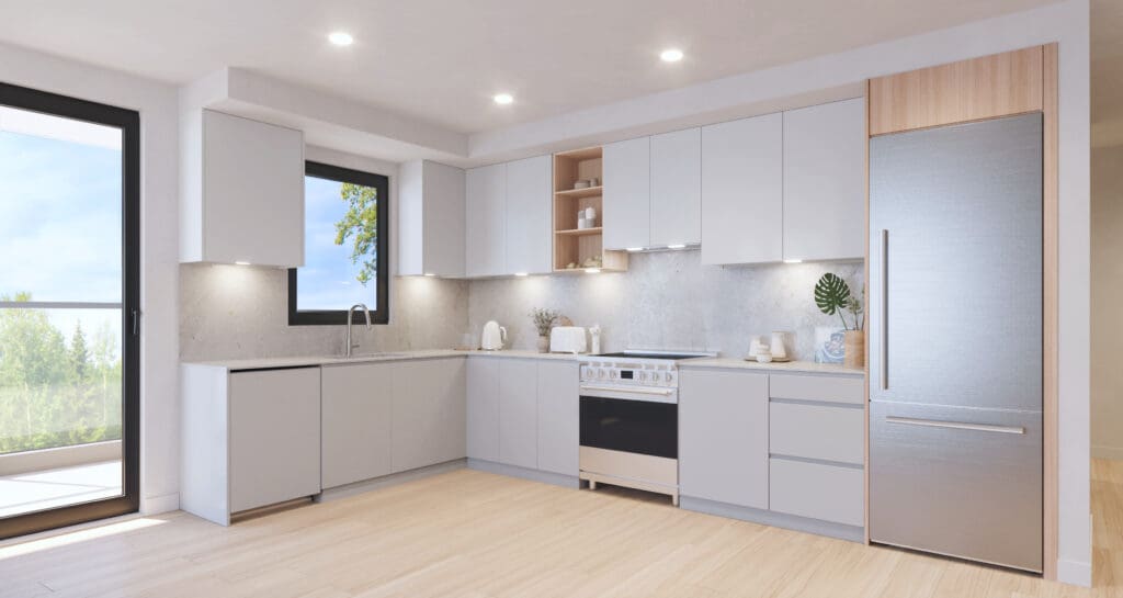
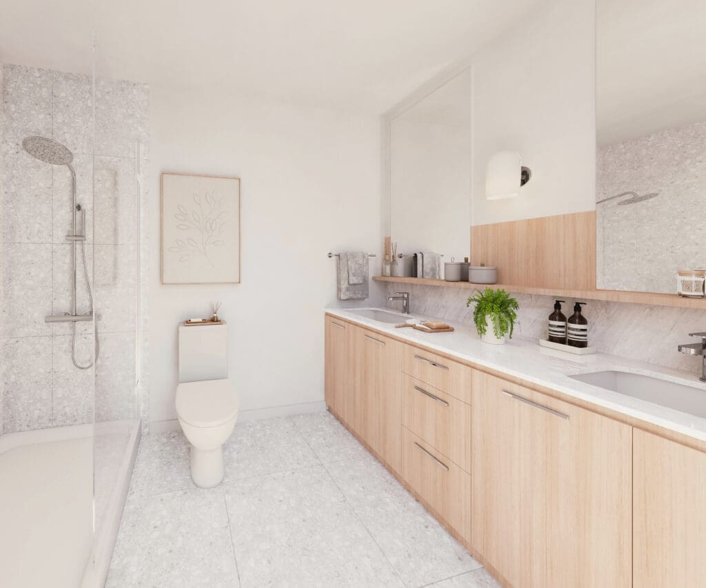
It’s true that many homeowners are gravitating towards lighter color palettes. Our winters can be quite grey on the West Coast, and people often crave that sense of brightness and warmth in their homes. Lighter tones tend to reflect more light, making spaces feel more open and airy.
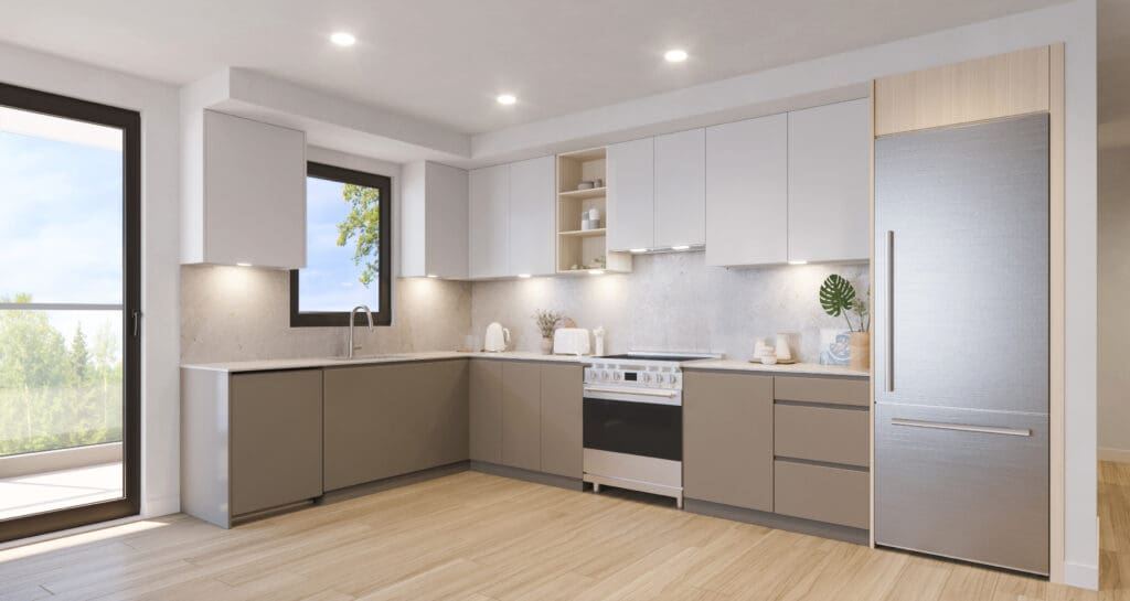
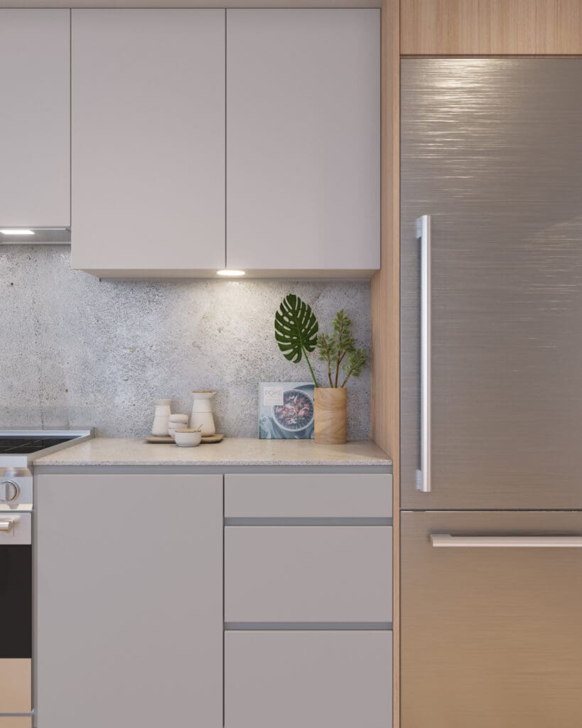
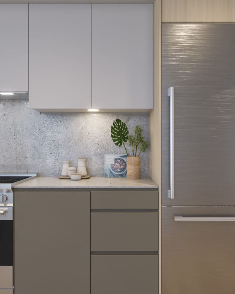
However, dark color schemes are also evolving in exciting ways. We’re seeing a shift towards warmer, richer tones that create a sense of elegance and intimacy. Think deep charcoals, warm browns, and even navy blues. These colors can add a touch of drama and sophistication to a space, especially when paired with contrasting accents and textures. This is a shift from previous light and dark scheme contrasts we’d typically see in new developments. Now, we are really ensuring both schemes have warmth to them, and I’ve been finding that the dark scheme ends up looking a little more sophisticated, which you can see in the recent homes we’ve designed for Porthaven PoCo, whereas the light schemes are a little more airy and youthful.
How can lifestyle factors, such as having pets or young children, influence the decision to go with a light or dark color palette?
Lifestyle definitely plays a role in choosing a color palette. Lighter floors can be more forgiving when it comes to pet fur and dust, while darker cabinets might be a better choice for hiding fingerprints from little hands. But honestly, with today’s durable finishes, both light and dark palettes can work well for families with pets or young children. It ultimately comes down to personal preference and the overall aesthetic you’re trying to achieve.
Do you have any advice on blending different wood tones or integrating existing furniture when choosing a new color scheme?
Creating a cohesive look when blending different wood tones or incorporating existing furniture is all about understanding undertones.
- Warm vs. Cool: Identify whether your existing pieces have warm (yellow, orange, red) or cool (grey, blue) undertones. Stick with one family to create a sense of harmony.
- Unifying Element: Tie different wood tones together with a common color accent. For example, black hardware or accessories can create a cohesive look.
- Strategic Placement: Consider the placement of furniture pieces to balance different wood tones and create visual interest.
How does natural light exposure in a home, like corner versus studio units, play a role in determining the most suitable color palette?
Natural light plays a significant role in how a color palette appears in a space.
- Corner Units: These light-filled spaces can handle both light and dark palettes. Consider how bright you want the space to feel. Darker tones can help subdue excessive brightness, while lighter tones will enhance the airy feel.
- Studio Units: In smaller spaces with limited natural light, a lighter palette can help create a sense of openness. However, a darker palette can also work if done thoughtfully, adding a cozy and intimate vibe.
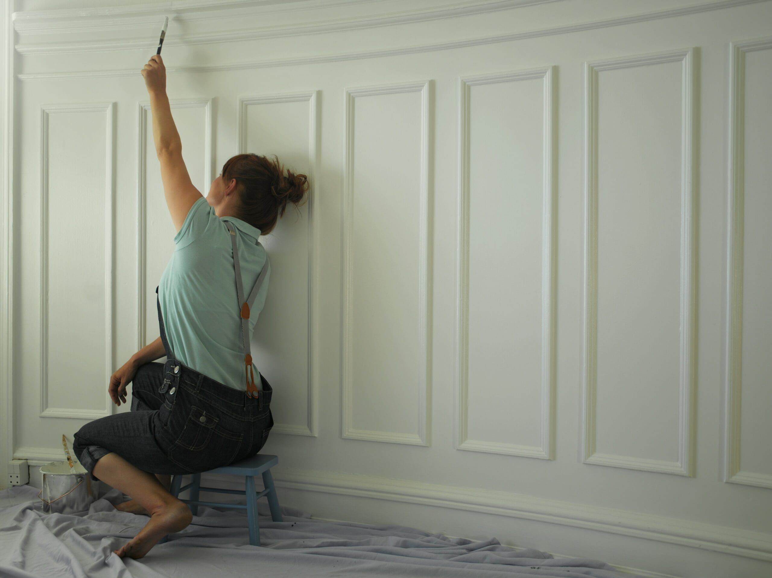
Additionally, room wallpaper can provide an opportunity to experiment with patterns and colors, creating a focal point or enhancing the ambiance of the space.
Ultimately, the best color palette is the one that makes you feel most comfortable, is the most suitable to your lifestyle, and reflects your personal style.
January 16th, 2025 at 4:28 am
Im grateful for the blog.Really looking forward to read more. Great.
January 17th, 2025 at 4:14 am
Hello. fantastic job. I did not imagine this. This is a great story. Thanks!
January 18th, 2025 at 4:00 am
F*ckin’ amazing things here. I am very glad to see your article. Thanks a lot and i’m looking forward to contact you. Will you please drop me a mail?
January 18th, 2025 at 10:25 am
There’s certainly a lot to know about this topic. I love all the points you’ve made.
January 19th, 2025 at 4:55 am
When I initially commented I clicked the “Notify me when new comments are added” checkbox and now each time a comment is added I get three e-mails with the same comment. Is there any way you can remove me from that service? Bless you!
January 20th, 2025 at 1:33 am
Thanks for the article post.Really looking forward to read more. Awesome.
January 20th, 2025 at 5:07 am
Hey, thanks for the blog post. Really Cool.
January 20th, 2025 at 7:16 am
Thanks-a-mundo for the blog article. Great.
January 20th, 2025 at 10:24 am
I think this is a real great article.Really thank you! Keep writing.
January 20th, 2025 at 1:33 pm
Thanks so much for the post.Thanks Again. Great.
January 20th, 2025 at 11:43 pm
I truly appreciate this blog post.Thanks Again. Really Great.
January 21st, 2025 at 3:52 am
Thanks again for the blog post.Really thank you! Great.
January 21st, 2025 at 8:38 am
Thanks so much for the blog article. Will read on…
January 21st, 2025 at 12:19 pm
I cannot thank you enough for the article post.Really thank you! Fantastic.
January 23rd, 2025 at 4:27 am
ivermectin for human ivermectin after vaccine
January 23rd, 2025 at 8:17 am
help with assignments uk – write my paper for me help writing essays
January 23rd, 2025 at 9:17 am
I have to thank you for the efforts you have put in writingthis blog. I am hoping to see the same high-grade content from you later on as well.In truth, your creative writing abilities has motivated meto get my own blog now 😉
January 23rd, 2025 at 10:45 am
Good way of explaining, and fastidious paragraph to get data concerning my presentation subject matter, which i am going to convey in university.
January 23rd, 2025 at 2:33 pm
Thanks in support of sharing such a fastidious opinion, post is good, thats why i have read it entirely
January 23rd, 2025 at 11:41 pm
I really liked your blog article.Thanks Again. Cool.
January 24th, 2025 at 1:33 am
chloroquine phosphate over the counter chloroquine phosphate online
January 24th, 2025 at 2:36 am
Great post.Thanks Again. Cool.
January 24th, 2025 at 5:09 am
Thanks for the article.Thanks Again. Great.
January 24th, 2025 at 5:20 pm
I’ve started using CBD gummies like https://www.cornbreadhemp.com/products/full-spectrum-cbd-gummies , and they’ve made a noticeable quarrel in my routine. They’re casually to use, style gigantic, and provide a comprehensible character to unite CBD into my day. I’ve establish they better me put one’s feet up and enhance my drop after a long day, which has been a huge benefit. The in keeping CBD dosage in each gummy is a enormous with an increment of in return managing intake. If you’re all in all CBD, gummies are an remarkable choice to start with—honourable pocket persuaded you determine a loyal discredit payment the most artistically results!
January 26th, 2025 at 1:41 am
prednisone online sale – prednisone cream brand name prednisone 4 tablets daily
January 26th, 2025 at 6:02 am
Fastidious response in return of this query with genuine arguments and telling the whole thing about that.
January 27th, 2025 at 12:39 am
how long does azithromycin affect birth control – azithromycin cvs over the counter z pack dental infection
January 27th, 2025 at 4:16 am
Thanks-a-mundo for the article.Thanks Again. Fantastic.
January 28th, 2025 at 2:11 am
I want to to thank you for this very good read!! I definitely enjoyed every little bit of it. I’ve got you bookmarked to check out new stuff you postÖ
January 28th, 2025 at 7:50 am
Howdy! This article couldn’t be written much better!Reading through this post reminds me of my previous roommate!He continually kept preaching about this. I’ll sendthis article to him. Pretty sure he’ll have a great read.Thank you for sharing!
January 29th, 2025 at 8:35 am
I wanted to thank you for this very good read!! I absolutely loved every bitof it. I have got you book marked to look at new things you post…
January 29th, 2025 at 12:34 pm
This is one awesome blog article.Much thanks again. Want more.
February 3rd, 2025 at 9:23 am
Enjoyed every bit of your article post.Really thank you! Really Cool.
February 3rd, 2025 at 10:27 am
como empezar a salir con una chicaLa efectividad de la comunicacion depende en gran medida de los temas seleccionados para la comunicacion.
February 3rd, 2025 at 11:40 am
wow, awesome blog.Really looking forward to read more. Much obliged.
February 4th, 2025 at 2:19 pm
Yeah bookmaking this wasn’t a speculative determination great post!My blog post: Hu.Feng.Ku.Angn.I.Ub.I..Xn–.U.K37@cgi.members.interq.or.jp
February 5th, 2025 at 1:20 am
duloxetine reviews side effects of duloxetine warnings for cymbalta
February 6th, 2025 at 11:52 pm
Usually I do not read article on blogs, however I would like to say that this write-up very compelled me to try and do it! Your writing taste has been surprised me. Thanks, very nice post.
February 8th, 2025 at 10:40 am
An intriguing discussion is definitely worth comment. I do believe that you should publish more on this topic, it might not be a taboo subject but typically folks don’t speak about such topics. To the next! All the best!!
February 10th, 2025 at 12:46 pm
Thank you, I’ve recently been searching for info about this topic for a long time and yours is the best I’ve came upon so far. However, what about the bottom line? Are you certain about the supply?
February 17th, 2025 at 7:30 am
Hello my loved one! I want to say that this post is awesome, great written and include approximately all vital infos. I would like to look extra posts like this .
February 18th, 2025 at 1:42 am
Enjoyed every bit of your blog.Much thanks again. Want more.
February 18th, 2025 at 4:07 am
wow, awesome blog article.Thanks Again. Much obliged.
February 18th, 2025 at 5:34 am
Thanks for sharing your thoughts on günstige smartwatch test 2020.Regards
February 18th, 2025 at 8:31 am
Fantastic post.Thanks Again. Really Cool.
February 20th, 2025 at 1:53 am
I truly appreciate this post.Really thank you! Much obliged.
February 20th, 2025 at 5:43 am
Thanks a lot for the blog article.Much thanks again. Will read on…
February 20th, 2025 at 9:27 am
Im obliged for the blog.Really thank you! Fantastic.
February 20th, 2025 at 11:37 pm
Very good article.Thanks Again. Want more.
February 22nd, 2025 at 3:28 am
This will help you to gain experience, while challenging yourself to play better.
February 22nd, 2025 at 4:53 am
Hi there, just became alert to your blog through Google, and found that it’s really informative.I’m going to watch out for brussels. I’ll appreciate if you continue this in future.Lots of people will be benefited from your writing.Cheers!