We tapped one of Toronto’s top interior designers to ask her all about the most common design mistakes she comes across and how exactly the average Jane or Joe can avoid them. Rebecca Hay takes a deep dive into her tips and tricks below! —Vita Daily
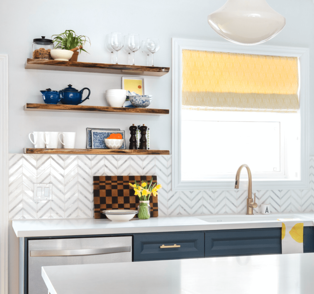
not enough focus on function & getting too caught up in trends. Open shelves are a great example. Yes, open shelves are trendy and look very nice, but if open shelving doesn’t work for you, once the fad passes, you’ll be stuck with it and begin to dislike your space. Design your space to function and work for you. Another great example is the kitchen; think about the kitchen triangle and how it works for you. For me, I love to keep the fridge in what I like to call the “entertaining area” and the sink and stove in the “cooking zone”. This configuration works for me, but everyone uses the kitchen differently. So start with a floor plan, and think about function first and then about the finishes and pretty stuff.
thoughtless storage location. People often don’t spend enough time thinking about the location of their elements when renovating. A great example is the location of the kitchen garbage bins. This may be one of my kitchen pet-peeves—placing your garbage unit under your sink! I completely understand that usually the space under the sink is just wasted space, but placing your garbage under the sink just ensures that your home cook will get frustrated as they’re prepping dinner and everyone keeps getting in the way to get into the garbage bins. My tip is to place the garbage NEXT to the sink. It will still be accessible to the cook and even more so for the rest of the family. In regards to the “wasted space” under the sink, you are now able to get creative and use that as additional storage for your kitchen items. Again it all goes back to thinking about how your kitchen functions.
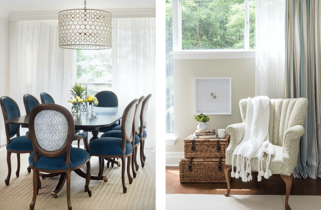
not budgeting enough for furnishings. No one wants a beautifully renovated home that’s empty! Where are you going to sit with no chairs or sofas? Plan ahead—save some of your renovation budget for quality furnishings. This isn’t to say that everything in your home has to be custom, but I do advise if you’re able to go custom with some pieces that would ideally last a lifetime, I would do it! Don’t be afraid of spending the money and then disliking a piece in a few years because it may feel old and dated. If a piece of furniture is good quality you can give it a little TLC (i.e., recover or refinish or reupholster) to bring into style again down the line.
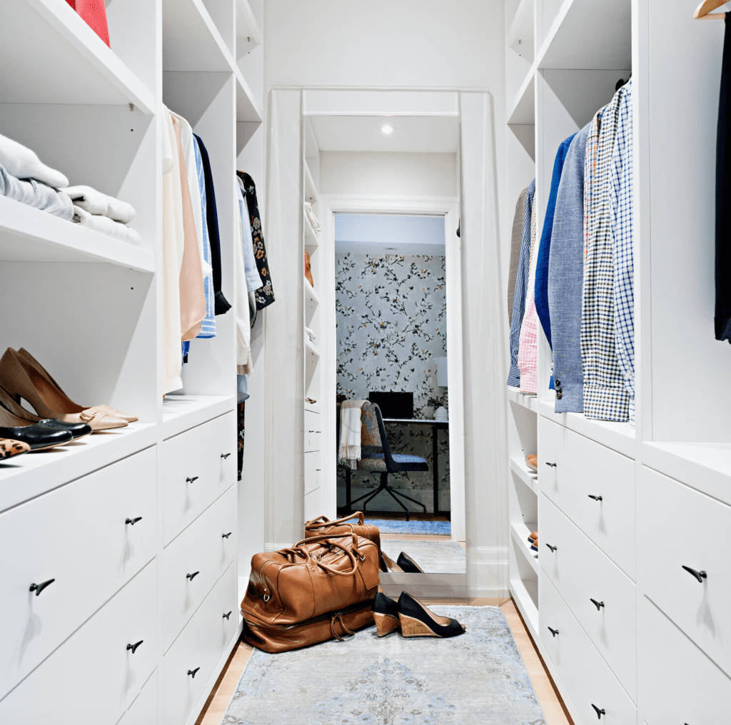
not having dedicated storage. I find that people often don’t think about how they want to store their items, such as a Breville juicer. If you’re already tearing your house apart for a Reno, spend some time thinking about which drawer or shelf is going to house which items and build around them. If you have a Nespresso coffee machine and a lot of coffee pods, why not build a custom drawer that has custom inserts for those specific pods, or custom partitions for the type of tea that you may drink. Another great example of dedicated storage is a walk-in his and hers closet. What often happens is our team comes up with the closet design, and then we have our clients take a look at the layout and decide how they prefer to store their items. For example you may have a lot of long dresses and need a lot of full height hanging space, or you may like to fold your sweaters instead and need more shelves. How YOU use your space is really important—spend some time assessing your needs before planning out how you’re going to design your space.
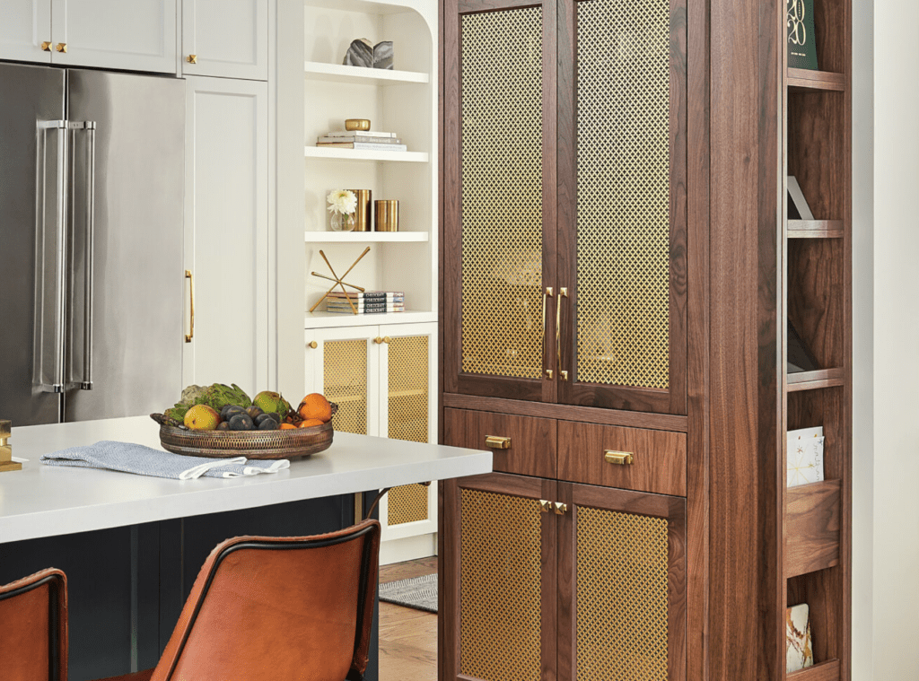
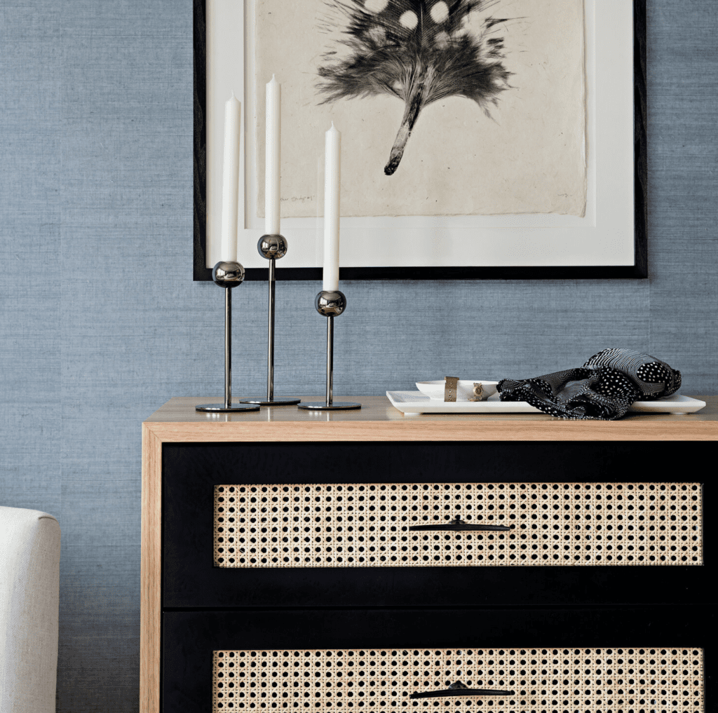
dated hardware. This is one of the most common design mistakes I see! Often kitchen companies or builders have their basic grade hardware, and people just go with that because they think it’s their only option. It’s not! Get creative with your cabinet hardware, it’s the jewelry in your home! You can find some unique hardware at consignment stores, antique markets, online, or even sometimes by asking your kitchen company or builder for additional options. Getting creative hardware can be a really affordable way to update and refresh an entire space.
rebeccahay.com

Be the first to comment