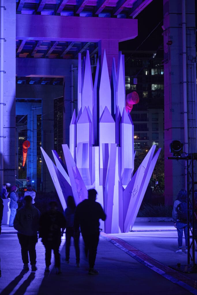
BeautiTone has revealed its 2025 Colour of the Year, Midnight Flora—a rich, dramatic red-purple shade that evokes the mystique of a twilight garden. As the centrepiece of the 2025 Colour Trends palette, Midnight Flora is part of a collection that celebrates fleeting moments of beauty in nature. In this Q&A, we dive into the inspiration behind Midnight Flora and explore how Canadians can use BeautiTone’s bold, imaginative colours to create striking, transformative spaces. We asked Kristen Gear, lead design and colour specialist at BeautiTone Paint and Home Products to reveal the magic behind this trendsetting hue. —Noa Nichol

What inspired the choice of Midnight Flora as the 2025 Colour of the Year, and how does it reflect current design and cultural trends?
Midnight Flora represents the growing trend toward imagination and creativity, and the allure of the unknown. With its rich depth, Midnight Flora invites Canadians to experience freedom of creativity and exploration. That creativity and exploration echoes the profound shift we’ve seen toward bold, striking spaces in recent design trends.
Midnight Flora has been described as a vivid shade of red-purple with magical, mysterious depth. How do you see homeowners and designers using this colour in their spaces, and what emotions do you hope it will evoke?
One bold design technique gaining momentum is “colour drenching”, where walls, furniture and décor are saturated with a single hue to create an immersive, cohesive space. With Midnight Flora, colour drenching can craft a moody, immersive space that is both bold and warm, invoking a sense of curiosity and endless possibility.
Can you tell us about the process of selecting the Colour of the Year and how Midnight Flora stood out from other potential choices?
Each year the BeautiTone Colour of the Year and Colour Trends Palette combines what we’re seeing in fashion, design, and culture, in a process that is equal parts research and imagination. For 2025, our trend palette is inspired by fleeting moments of beauty in the natural world, brought to life through colours that work well together in a palette we feel is sure to get Canadians excited to paint.
Midnight Flora is part of a larger 2025 Colour Trends palette, which includes hues like Stillness, Bloom, and Drift. How do these supporting neutrals complement Midnight Flora, and how would you suggest pairing them for a cohesive design?
This year our supporting neutrals include Celestial, Hushed, Smudge, and Moonshadow, and each complements our 2025 Colour Trends hues to suit a range of different design tastes. For example, “Hushed” can be paired with Midnight Flora to create a sophisticated and elegant contrast. The rich, moody depth of the purple adds drama, while the softness of the light beige balances it out, bringing a sense of calm and subtle warmth to the palette.
The sculpture inspired by Midnight Flora at Nuit Blanche examines how the colour shifts through light and time. How do you think different lighting conditions impact the look and feel of Midnight Flora in a space?
Midnight Flora offers an opportunity to explore depth and drama with different lighting choices — or even as the hue plays with natural light throughout the course of the day. Cooler lighting evokes the magic and magnificence of a deep purple, inviting a sense of ethereal mystery. As warmer lighting is introduced, we can experience a shift towards the warm and moody reds. This emotive shift is what KWEST, so skillfully demonstrated in his Midnight Flora sculpture at Nuit Blanche — using geometric design to showcase how perspective, light and shadow can evoke a range of emotions with a single hue.
With so many paint brands in the market, how does BeautiTone ensure its colour selections, such as Midnight Flora, resonate with both contemporary tastes and Canadian homeowners’ preferences?
As Canada’s number one Canadian-made and owned paint brand, BeautiTone is proud of our heritage and commitment to Canadian homeowners. We have a dedicated team of colour trends experts based out of our cutting-edge facility in Southwestern Ontario, but the most important element of our product development starts in our Home Hardware, Home Building Centre, and Home Hardware Building Centre stores. We have over 1,000 locations across Canada, and our dedicated Dealers and store staff are critical in helping us stay close to our customers’ evolving tastes. Our annual Colour Trends Palette is a product of this research combined with inspiration from distinguishing trends we see happening in the worlds of fashion, design, and culture.
What are your personal tips or favorite design ideas for incorporating bold colours like Midnight Flora into a home without overwhelming the space?
Double drenching has been a favourite design trend of mine recently, which is where related colours are paired to create a heightened visual impact while combining colours not typically seen together in a single scheme. Midnight Flora is perfect for this technique and to elevate your design, can be paired with Stillness, a deep green with blue undertone, or Bloom, which is a gentle pink with a hint of yellow. Break up the intensity by playing with different finishes. For example, a matte or flat finish on the walls with a satin or gloss sheen on the trim adds subtle dimension.

Be the first to comment