Homebuyers face a significant design choice when selecting color palettes for cabinetry, countertops, flooring, and tiling—features that shape a home’s look and feel for years to come. Natalia Kwasnicki, partner at Portico Design Group, shares insights on why most buyers lean toward lighter schemes and offers tips on making the right choice for lasting style and functionality. —Noa Nichol
What factors do you recommend homebuyers consider first when deciding between a light or dark color palette for permanent features?
When choosing between a light or dark color palette for your home, I encourage buyers to consider three key factors:
- Natural Light: How much natural light does the space receive? A light-filled room can handle a darker palette, while a space with limited natural light might benefit from a lighter, brighter scheme.
- Existing Furnishings: Consider the tone and color of your current furniture. Do you have warm wood tones or cool-toned upholstery? Choose a palette that complements your existing pieces.
- Desired Vibe: What kind of atmosphere do you want to create? Light palettes often evoke a sense of airiness and tranquility, while darker palettes can feel more sophisticated and intimate.
Why do you think light color schemes are trending among new homeowners, and how do they impact the feel of a space?
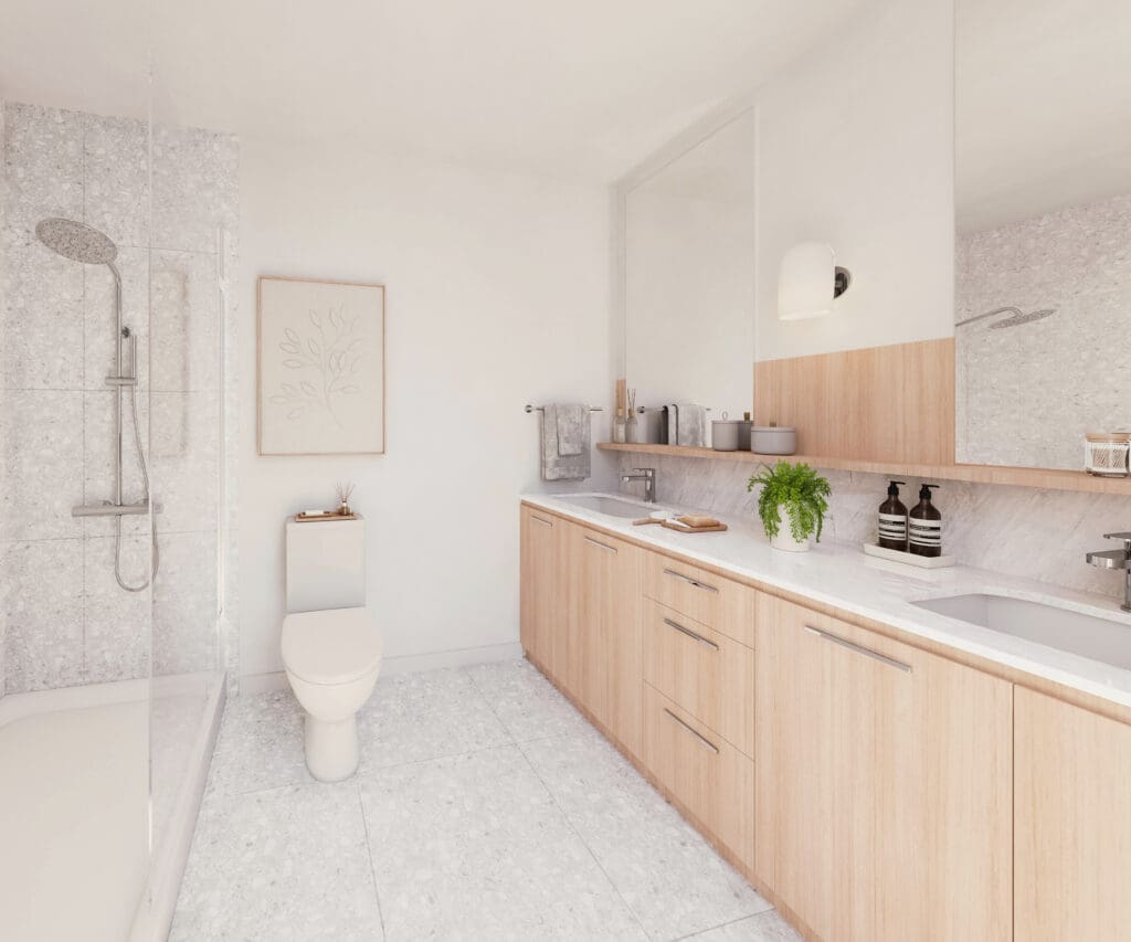
It’s true that many homeowners are gravitating towards lighter color palettes. Our winters can be quite grey on the West Coast, and people often crave that sense of brightness and warmth in their homes. Lighter tones tend to reflect more light, making spaces feel more open and airy.
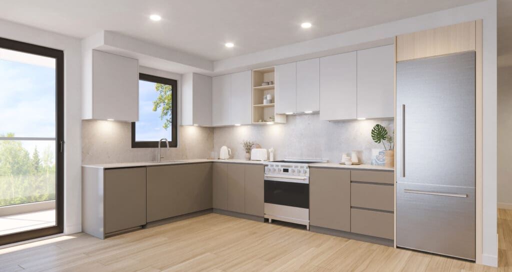
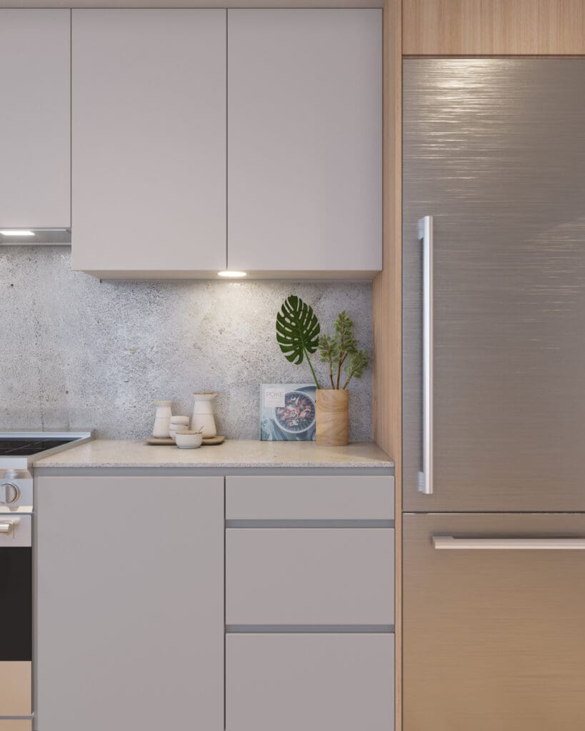
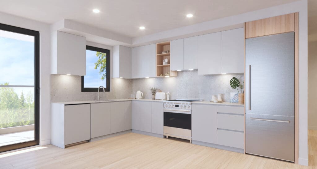
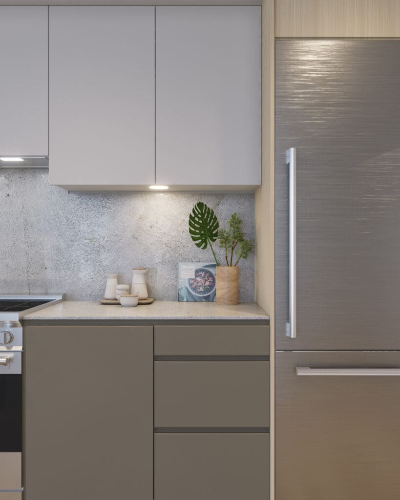
However, dark color schemes are also evolving in exciting ways. We’re seeing a shift towards warmer, richer tones that create a sense of elegance and intimacy. Think deep charcoals, warm browns, and even navy blues. These colors can add a touch of drama and sophistication to a space, especially when paired with contrasting accents and textures. This is a shift from previous light and dark scheme contrasts we’d typically see in new developments. Now, we are really ensuring both schemes have warmth to them, and I’ve been finding that the dark scheme ends up looking a little more sophisticated, which you can see in the recent homes we’ve designed for Porthaven PoCo, whereas the light schemes are a little more airy and youthful.
How can lifestyle factors, such as having pets or young children, influence the decision to go with a light or dark color palette?
Lifestyle definitely plays a role in choosing a color palette. Lighter floors can be more forgiving when it comes to pet fur and dust, while darker cabinets might be a better choice for hiding fingerprints from little hands. But honestly, with today’s durable finishes, both light and dark palettes can work well for families with pets or young children. It ultimately comes down to personal preference and the overall aesthetic you’re trying to achieve.
Do you have any advice on blending different wood tones or integrating existing furniture when choosing a new color scheme?
Creating a cohesive look when blending different wood tones or incorporating existing furniture is all about understanding undertones.
- Warm vs. Cool: Identify whether your existing pieces have warm (yellow, orange, red) or cool (grey, blue) undertones. Stick with one family to create a sense of harmony.
- Unifying Element: Tie different wood tones together with a common color accent. For example, black hardware or accessories can create a cohesive look.
- Strategic Placement: Consider the placement of furniture pieces to balance different wood tones and create visual interest.
How does natural light exposure in a home, like corner versus studio units, play a role in determining the most suitable color palette?
Natural light plays a significant role in how a color palette appears in a space.
- Corner Units: These light-filled spaces can handle both light and dark palettes. Consider how bright you want the space to feel. Darker tones can help subdue excessive brightness, while lighter tones will enhance the airy feel.
- Studio Units: In smaller spaces with limited natural light, a lighter palette can help create a sense of openness. However, a darker palette can also work if done thoughtfully, adding a cozy and intimate vibe.
Ultimately, the best color palette is the one that makes you feel most comfortable, is the most suitable to your lifestyle, and reflects your personal style.
Be the first to comment