It’s that time of the year again—and we’re not talking about the holiday season. Rather, winter is when the world falls in love with fresh palettes of colour that signify a shift in aesthetic for the year ahead. The most highly anticipated of these—Pantone’s Color of the Year—will drop on December 5, marking 25 years of the program, first introduced by the colour authority to set the mood for the new millennium.
“Our first selection was PANTONE 15-4020 Cerulean, a cool blue hue that has long been associated with the soothing effects of the sky and sea,” says Laurie Pressman, VP of the Pantone Color Institute. “The year 1999 was a time of great expectations and excitement, but there was also this huge fear factor happening as some prognosticators directly predicted [disasters] ranging from giant computer meltdowns to the destruction of civilization. Choosing Cerulean offered an antidote to the stress of the time and highlighted the relationship between colour and culture.”
Since that first introduction, the Pantone Color of the Year has become an anticipated announcement for the world’s style elites. Pressman says the Pantone selection process takes almost two years and includes a great many conversations between up to 20 key members of the Pantone Color Institute Team.
“Areas we look to for influence include the entertainment industry and films in production, travelling art collections and new artists, fashion, all areas of design and popular travel destinations,” she shares. “Other considerations are new lifestyles, playstyles, socio-economic conditions, new technologies, materials, textures and effects that impact colour, social media platforms and sporting events.” (Phew!)
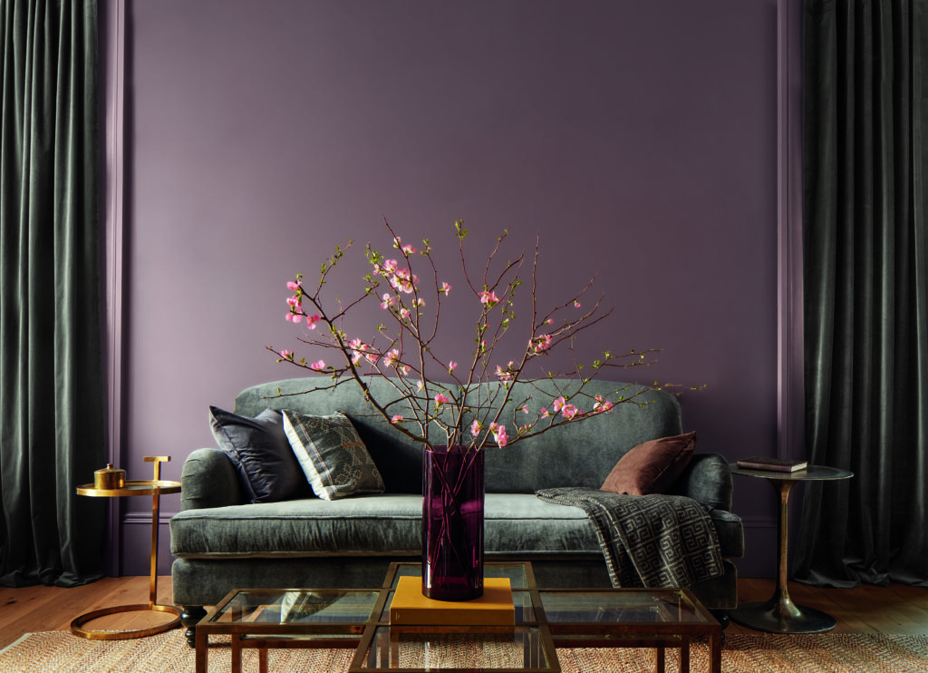
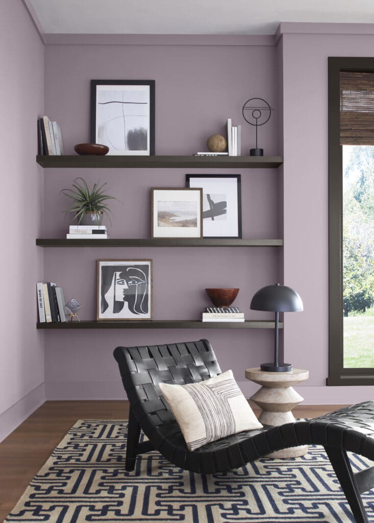
Keeping in step with Pantone, the introduction of annual hero shades has become a mainstay for many paint and décor brands. Benjamin Moore colour expert Sharon Grech says though the company has been creating colour trend reports for 60-plus years, those were initially only shared with design professionals. As interest in colour and design trends grew, Benjamin Moore brought trend information to consumers in the early 2000s and, in 2010, launched its first Colour of the Year. For 2025, the shade Cinnamon Slate is the brand’s cool-meets-cozy select—a tone Grech believes perfectly embodies the current love of muted shades, but with a strong punch of pigment.
“Quietly colourful hues are in the forefront right now,” she explains. “The tones that felt most relevant are those with a softer quality, which led us to zone in on soft plums, browns and greens, those beautiful “in-between” hues with their unique undertones that make them adaptable and easy to personalize in a space.”
Grech loves the idea of going all in with Cinnamon Slate as a bedroom colour, but also using it in public spaces like hallways and living rooms. Because it has a nuanced vibe, it gives a subtle presence and works well in small spaces, too. Colour drenching is another beautiful way to use trending tones, and is a technique universally loved by designers.
“Colour drenching is focused on embracing a single hue for an entire room—walls, furniture and décor—to create a cohesive space,” explains Kristen Gear, lead design and colour specialis for BeautiTone paint and home products. “For 2025, Midnight Flora is BeautiTone’s Colour of the Year—a shade that’s a unique blend of red and blue with a lot of depth to it, which is quite captivating and sparks curiosity and imagination. When used for colour drenching, it creates a moody and immersive environment and makes spaces bold and warm in a very bespoke way.”
Gear says the choice of such a statement shade is reflective of research done by the BeautiTone team, which revealed Canadians want to explore colour on a deeper, emotional level. People want to add fun to their space and take risks with the hues they choose to decorate with.
The recommendation of on-trend colours lends guidance and expertise—and this is exactly why Sherwin-Williams has expanded its annual star shade recommendation to an entire palette. The 2025 Color Capsule of the Year lineup features nine striking tones ranging from warm brown (Grounded) to deep blue grey (Rain Cloud), saturated yellow (Chartreuse) and soft plummy pink (Mauve Finery). Susan Wadden, director of colour marketing for the brand, loves this year’s curated capsule because it offers something for everyone: “I don’t believe any colour is easier than another to incorporate into existing design schemes, because it really depends on what’s already happening in someone’s home. The capsule can be used as a guide for decorating entire spaces or, on a micro level, choose impactful décor details like florals, art or pillows.”
Given the fact there are multiple expert colour forecasts for 2025—each of them dramatically different from each other—is there a right or wrong way to decorate? Louis Duncan-He, president of and creative director of Louis Duncan-He Designs in Calgary, says the design process should always be a fluid one and you should only choose elements that feel authentic to you, regardless of what’s trending.
“With my clients, I encourage them to use colour trends to inspire them about the way they look at their spaces and light a spark to push them outside of what they would typically do,” he says. “In my business, we work to understand the building blocks of who someone is and then determine if we can bring a certain trend into their world. The most important thing to me is that design must always align with who you are as a person and match your DNA.” —Alison McGill


Be the first to comment