
While most paint brands are busy unveiling their splashiest shade predictions for 2026, Zinsser—the authority in primer for more than 175 years—is turning the spotlight on where all colours begin: white. In a first-of-its-kind move, the brand has declared its own Colour of the Year, not a trend-driven hue, but the original, essential base coat that makes every other colour shine. We caught up with Frank Kocis, Senior Manager of Integrated Communications & Trade Marketing at Rust-Oleum Canada, to talk about why primer deserves its moment, the thinking behind this unconventional choice, and why every Colour of the Year story should start with Zinsser White. —Noa Nichol
Zinsser’s first-ever Colour of the Year isn’t a trend shade, but primer itself — why was it important to spotlight this “essential first coat” in the broader colour conversation?
People want their indoor spaces to really speak clearly about their personalities and the colours they choose are a reflection of that. They fall in love with the paint chip but often end up frustrated by the fact that the end result doesn’t match their chip. And despite the fact that most higher end paints contain some element of primer, you still may need to apply multiple coats to get the look — which can be expensive and time consuming. Zinsser primers are the essential first coat that will get you that perfect match to the colour you fell in love with — and get you there in less time.
In interior design terms, how does starting with the right primer influence the final look and feel of a room’s colour palette?
“Prime” means both “first” and “to make (something) ready for use or action.” Using a primer before applying your colour will ensure that your colour will have less chance of getting washed out or undermined by what was originally on the walls. It’s also essential if you’ve got stains or other discolouration on your walls. A good primer conceals a multitude of sins.
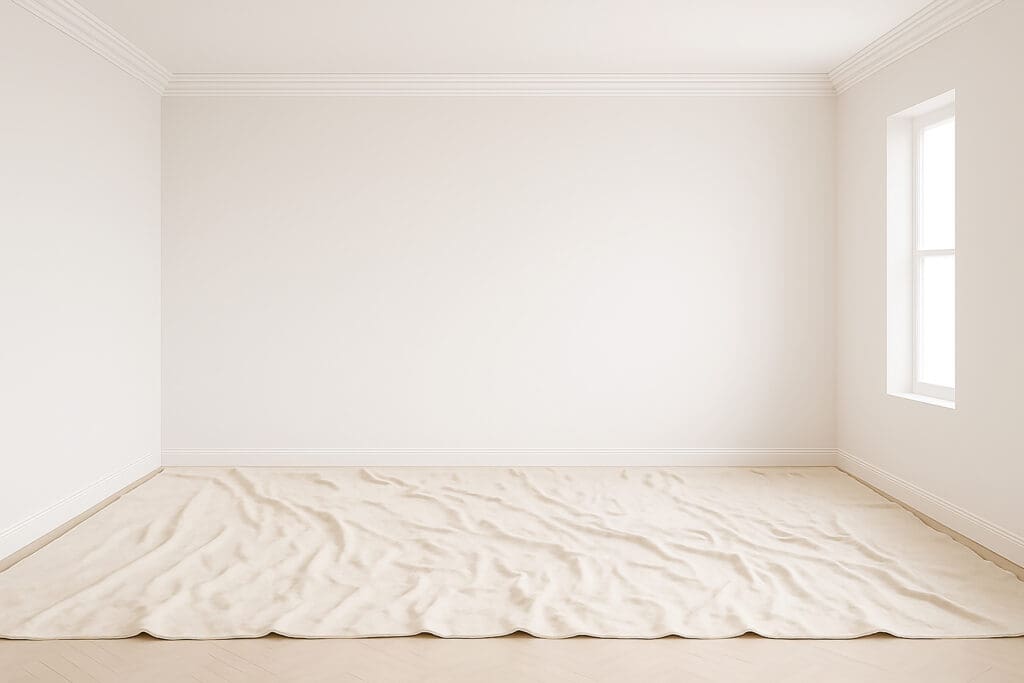
White has long been associated with purity and possibility in decor. How does Zinsser’s “White” embody both a literal and symbolic fresh start for any space?
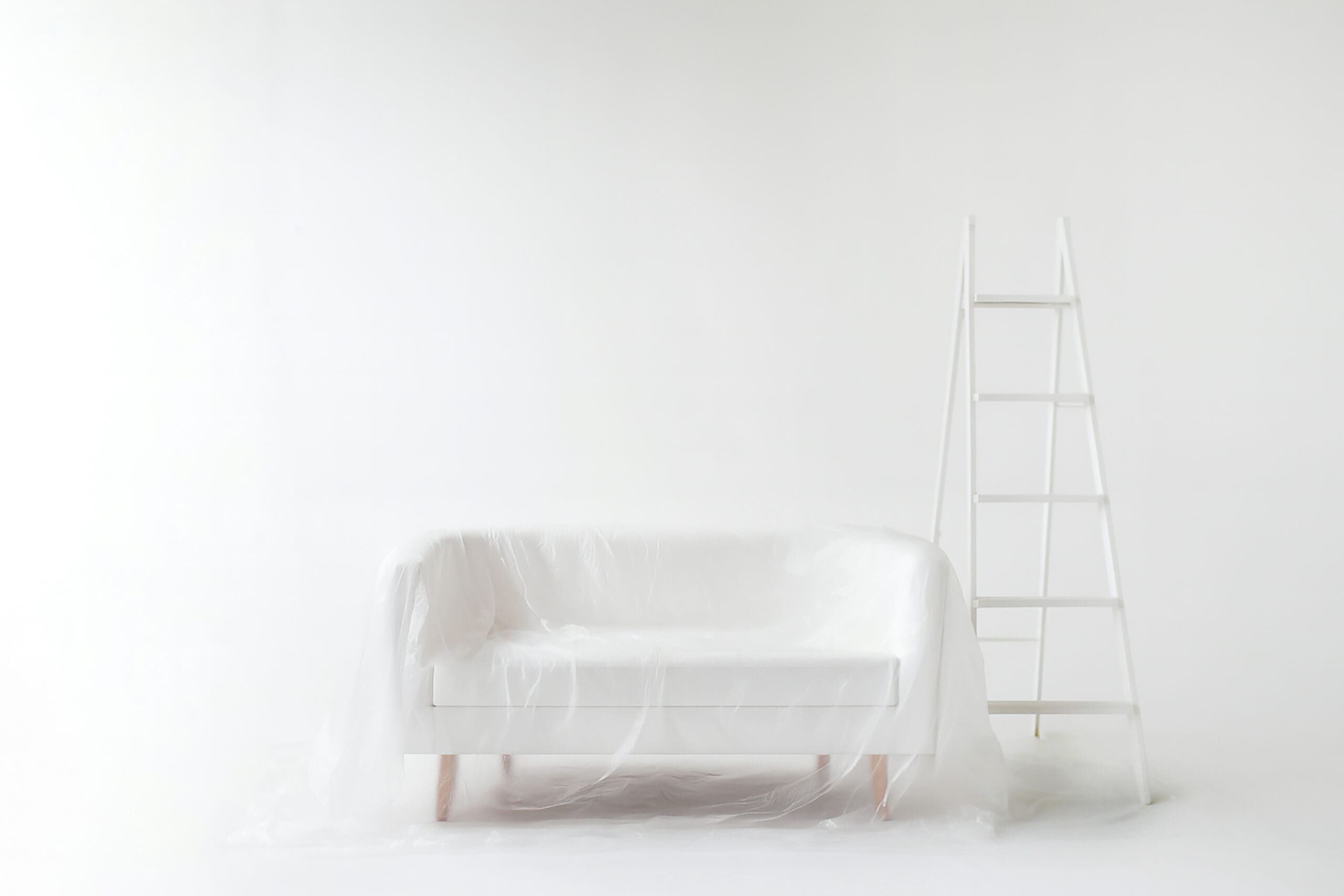
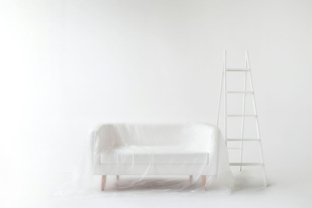
Without getting too philosophical, a white wall is essentially a void offering the eye infinite depth and limitless horizon. That blankness is terrifying and awe-inspiring in equal measure. I think that when confronted with a void, the natural human impulse is to fill it and that void is essentially the wizard’s caldron where base materials (paint, furniture, accessories) combine with the talent and imagination of the magician (the homeowners or designer in this case) resulting in a wonderful alchemy and, ultimately, a beautiful space that is greater than the sum of its parts.
When homeowners or designers are planning a major colour change — especially bold shades — what role does primer play in ensuring the best end result?
When making a dramatic colour shift — especially to bold or deep hues — primer is the essential first step to achieving a stellar, long-lasting finish. A quality primer like Zinsser seals the surface, blocks previous colours from bleeding through and creates a uniform base that allows your top coat to show its truest shade. It also helps paint adhere better, ensuring your bold new look stays vibrant and beautiful for years.
In your view, why is primer often overlooked in the decor world, and how is Zinsser aiming to change that perception?
In today’s market, many quality paints are promoted as “paint and primer in one,” leading some to believe a separate priming step is unnecessary. Not the case — professionals know that starting with a dedicated primer is the key to achieving flawless, lasting results every time. Zinsser is committed to showing homeowners, designers, professional painters and contractors why primer is an essential foundation, not an optional extra.
Can you share an example of a space where primer made the difference between a good paint job and a truly stunning finish?
A “good” paint job might look fresh at first glance but, up close, you’ll notice subtle inconsistencies such as hints of the old colour peeking through, faint shadows from patched areas or slight variations in sheen. Now imagine those same interior walls with a high-quality primer like Zinsser underneath. Every surface is sealed, stains and old colours are locked away and the texture is perfectly even. When the top coat goes on — the colour looks richer, more vibrant and completely uniform from corner to corner. Light reflects evenly and the edges are crisp — the kind of result that instantly elevates the entire space.
How do you see Zinsser’s Colour of the Year announcement inspiring or influencing design professionals in their 2026 projects?
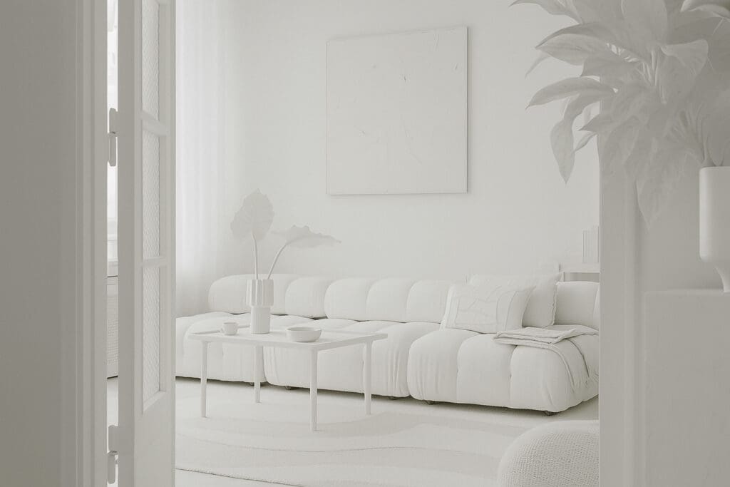
Zinsser’s 2026 Colour of the Year announcement is about empowering designers to dream big and take bold risks – with the confidence that what appears on the wall will perfectly match the vision in their mind.
Many Colour of the Year selections focus on emotional impact — calmness, energy, optimism. What emotional “effect” does primer, and Zinsser’s White specifically, bring to a design process?
Fluid adaptability, infinite creativity and transformative impact. Zinsser’s White is the ultimate blank canvas — ready to bring any vision to life. It amplifies the emotional effect of every Colour of the Year, helping designers achieve calmness, energy or optimism with greater precision and confidence. As the perfect complement to any palette the industry unveils, Zinsser ensures the final result is as powerful as the inspiration behind it.
From a practical standpoint, what are the biggest misconceptions homeowners or decorators have about primer?
Let’s be honest — most people don’t think of primer as the “sexy” part of a paint project. But a quality primer like Zinsser is the unsung hero: it saves time by reducing the number of paint coats you need, and it saves money by cutting down on how much paint you use. Frankly, I think those are some very attractive qualities.
How would you describe the relationship between primer and the designer’s creative vision — is it more like a foundation for a building or a blank canvas for an artist?
It’s both. Primer is the crisp new sheet of paper on which a designer writes the story of a space — clean, uniform and full of possibility. With Zinsser’s Colour of the Year, we’re spotlighting the advantages primer brings to every project, whether you’re working with a designer or a contractor or painting it yourself.
October 31st, 2025 at 8:50 pm
Every well-executed extension or home value improvement project has the potential to deliver impressive returns, especially when designed with modern buyers and practical living in mind.