

From fashion and beauty to interiors and digital culture, colour is often the first signal of where taste—and culture—is headed next. Ahead of the release of Pinterest Palette 2026, we sit down with Xanthe Wells, VP of Global Creative at Pinterest, to unpack the five hues poised to define the year ahead. Drawn directly from what people are searching, saving, and obsessing over, this year’s Palette—and its new, layered sub-palettes—offers a vivid snapshot of how we’re feeling now, and how we want to live next. —Noa Nichol
Pinterest Palette is rooted in real search and save behaviour. At what point do patterns become signals—and how do you know when a colour is truly ready to “break through”?
We start to see a real signal when interest in a color isn’t just spiking, but sustaining —and when that interest is showing up across multiple categories at once. Our visual search technology lets us go deeper, decoding not just individual colors but how they’re being used together across fashion, beauty, home, and lifestyle. When a color consistently appears in those different contexts and starts to form a cohesive aesthetic, that’s when we know it’s ready to break through.
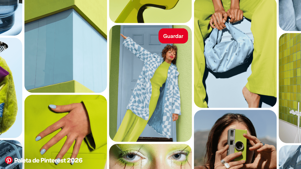
This year introduces sub-palettes for the first time. What creative or cultural shift made this feel like the right moment to move beyond single hero colours?
People aren’t thinking about color in isolation anymore – they’re thinking about how it makes them feel. On Pinterest, we’re seeing users pair colors to create a specific mood or emotional benefit, rather than committing to one standout hue. Sub-palettes felt like a natural evolution because they reflect how people are actually experimenting with color right now: mixing contrast, layering emotion, and building entire visual worlds instead of following one-note trends.
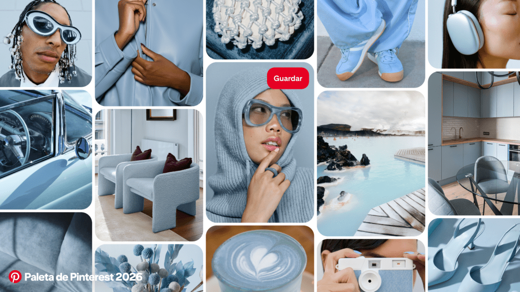
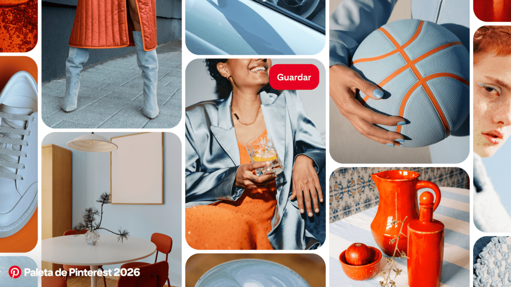
Cool Blue is positioned as a reset after years of beige and nesting neutrals. What does that say about our collective emotional state heading into 2026?
Cool Blue really captures that desire for a reset. After years of playing it safe with soft neutrals, people are ready for something that feels fresh and clarifying – but still calm. This shade is cooling and focused, almost like a mental deep breath. It signals a shift toward choosing color not just for how it looks, but for how it helps people feel as they move into a more intentional, optimistic mindset.
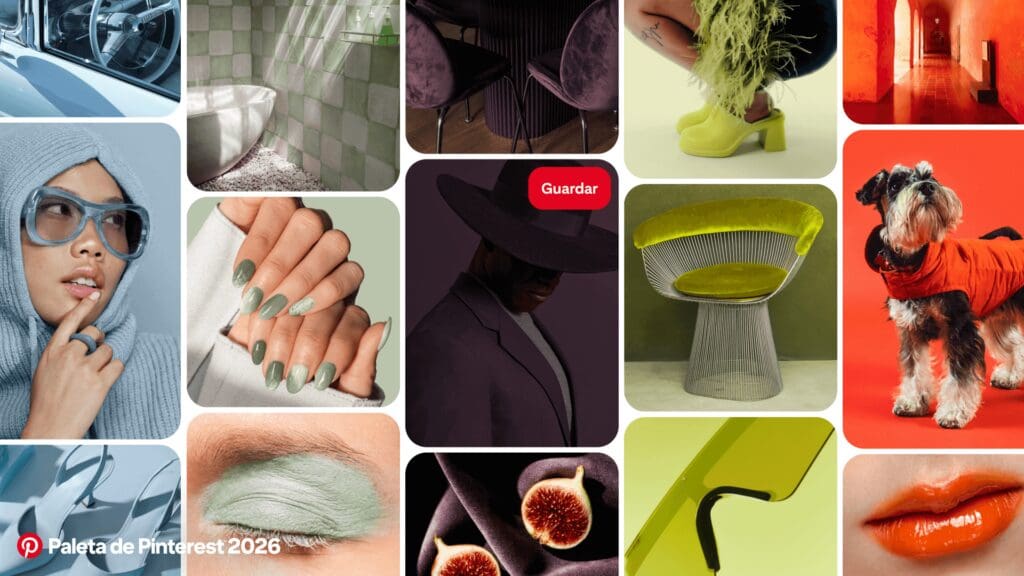
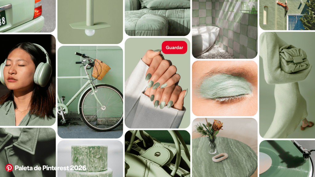
Jade is described as “nature dressed up.” How are people using it differently than traditional greens in fashion, beauty, or interiors?
Right now, it’s showing up less like a statement color and more like a quiet, sophisticated neutral. Instead of reading as earthy or seasonal, it feels clean, polished, and enduring – something people feel comfortable investing in for the long-haul. We’re seeing it in interiors as a foundational room color instead of a one‑off accent, heirloom-style jewelry, and beauty looks that feel subtle but considered.
If someone is colour-shy, what’s the easiest, least intimidating way to bring one of these 2026 hues into their life?
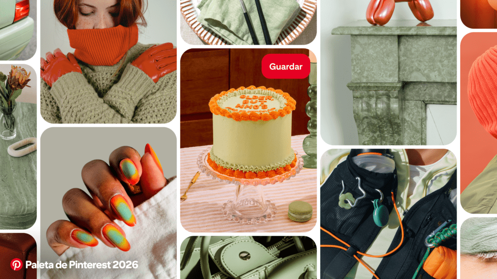
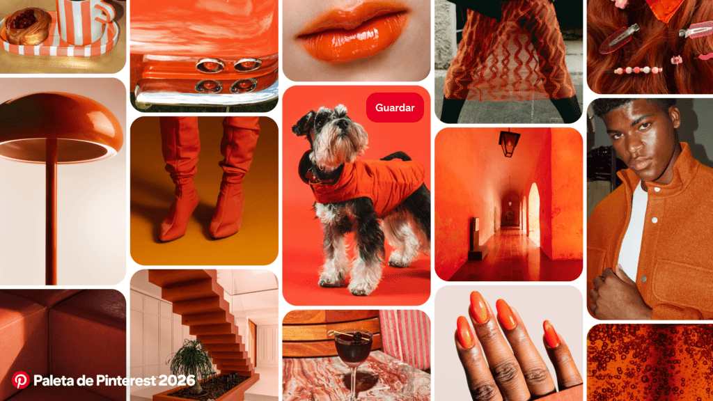
The easiest way is to start small. A beauty look, an accessory, or a single design detail is a low-pressure entry point – think a Jade nail, a Cool Blue accent, or a pop of Persimmon at home. A small touch is enough to shift the whole feel of a space or outfit.
January 28th, 2026 at 4:04 pm
I was inspired by Xanthe Wells’ Pinterest Palette 2026 – Cool Blue creates a fresh and calming effect after beige neutrals, while Jade is a sophisticated, natural neutral for interiors and accessories. I’ve already updated my wardrobe with accents in these tones: a Jade scarf and Cool Blue blouse create a harmonious, deliberate look that instantly lifts my mood. To add some bright accents to my wardrobe – dresses and accessories in trendy shades – I ordered through the couture candy . Now my looks are even more expressive and joyful.
April 17th, 2026 at 12:57 am
this year’s Palette—and its new, layered sub-palettes—offers a vivid snapshot of how we’re feeling now, and how we want to live next. —Noa Nichol