
As the Spring Equinox shifts the light in our homes, the arrival of the new season marks the perfect time for a restorative interior refresh. However, before you reach for this year’s trendiest butter yellow or sage green, Arianna Barone, Colour Marketing Manager at Benjamin Moore, suggests looking at your windows first. Because lighting affects every shade, understanding your room’s natural exposure is just as vital as selecting the colour family itself.
We sat down with Arianna to discuss how to choose colours that go beyond fleeting trends and work harmoniously as light shifts throughout the day. From counteracting the cool tones of a North-facing nook to balancing the intense golden-hour glow in a West-facing lounge, she shares her professional guide to mastering the seasonal shift in light. —Noa Nichol

The Lighting “Liar”: We’ve all picked a perfect swatch in-store only to have it look totally different at home. Why is the Spring Equinox the ultimate “truth-teller” when it comes to how our wall colours actually behave?
Sampling the paint colour in the actual space you are going to paint will help you understand how the colour will cast. The larger the sample the better. We recommend painting the sample on a piece of foam board that you can move around the space. Live with the colour for a few days, see how it casts throughout the day and under different weather conditions, like overcast vs sunny. That is really the ultimate truth-teller.
After the Spring Equinox, we typically get more sunlight. Western-facing rooms that previously felt dimly lit can benefit greatly from what feels like an extended golden hour. If your room relies on natural lighting, you will probably notice a brighter, lighter cast after the Spring Equinox which can affect how your paint colours cast.
North-Facing Rescue: North-facing rooms are notorious for that “cool” northern light. If someone is desperate to make a chilly room feel like a permanent hug, which creamy neutral is your secret weapon?
Look to colours that are warmer and have more of a yellow undertone than what you would typically consider. That yellow undertone will help to make the space feel brighter, warmer and balance out those shaded corners. Consider colours that are slightly lighter than what you may think you want as well. Start by finding a colour that you like and then look for something lighter and warmer. Sample both in the space to help you understand what will give you the look you are trying to achieve.
For a softer and lighter “hug” try off-whites like Acadia White OC-38 and Albescent OC-40.
For something a bit more grounding, opt for colours like Abingdon Putty HC-99 and Lenox Tan HC-44.
To create a cozy space that feels wrapped in colour, consider colour-drenching the room in enveloping colours like Misted Fern 482 and Rustique AF-275. Warmer colours tend to feel more inviting, so they are a go-to for creating a space you want to cuddle up in.
The “Golden Hour” Glow: West-facing rooms get that intense, beautiful evening sun. How do cool-leaning grays or blue-greens keep that “golden hour” from becoming a “neon hour” in a living room?
Any cooler colour, from violet to blue to green, will help balance out the sharper light that often comes along with golden hour in west-facing rooms. The cooler colour on the wall helps to soften the warm golden rays. Colour is reactive, so finding the perfect paint colour is about balancing that paint colour with the other design elements in the space, with lighting being the biggest factor.
Look to blue-greens for west-facing rooms because often times the mornings are more dimly-lit as the sun rises in the east. Then, as the sun moves throughout the day and sets, the lighting becomes brighter and sharper. Blue-greens often have a good amount of warmth in them, so they can bring some levity to the dimly lit mornings, and balance to brighter afternoons in west-facing rooms.
South-Facing Strategy: In a sun-soaked south-facing room, colours can easily “wash out”. What is the most daring serene dark hue you’d recommend to stand up to that all-day brightness?
For a “daring” colour, look to hues that have a more intricate undertone but still some gray in them to help balance out that bright natural sunlight. Colours like Jet Blue CC-870 have an alluring blue-violet undertone that will cast stronger in rooms that receive a lot of natural light. A smoky green – like Topsoil CC-692 – will cast lighter and greener, bringing a more classic look to the space without feeling too moody.
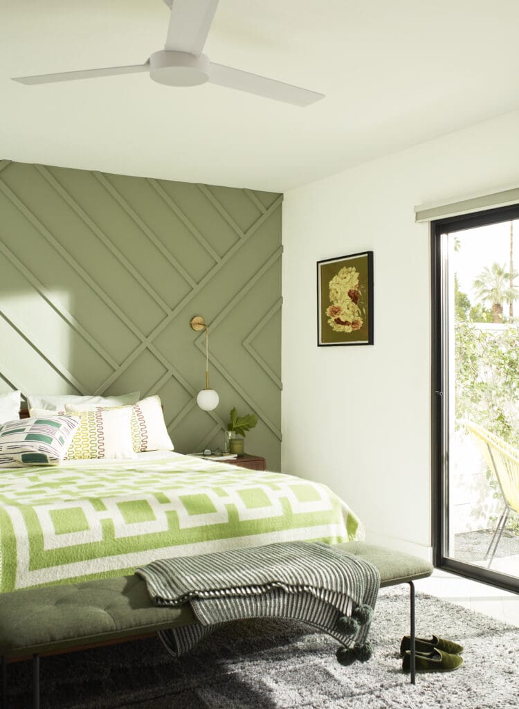
East-Facing Earthiness: You suggest mossy greens for east-facing rooms as the light becomes indirect. Why does this specific “earthy” palette keep the space from feeling flat in the afternoon?
Mossy green – like Rosemary Sprig 2144-30 and Oak Grove 489 – have notes of yellow in them which makes them lean warmer. This can help to lighten and brighten east-facing rooms as the sun moves and the light becomes more indirect and shadowed. Earthy palettes tend to include cozy, comforting colours which are traits inherent to warmer hues. These warmer colours can help to prevent the space from feeling flat.
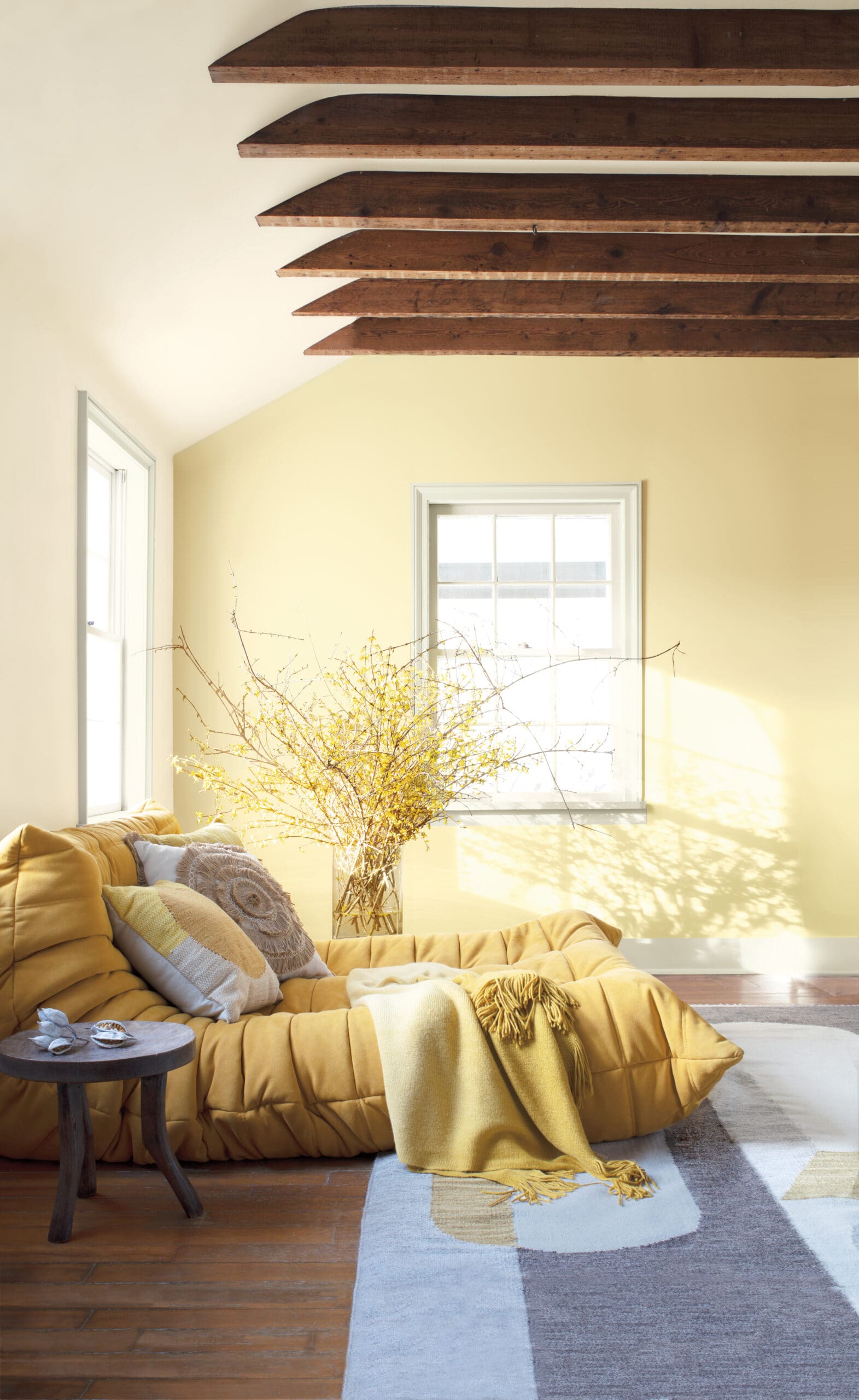
The “Butter Yellow” Debate: Many people instinctively reach for butter yellow or sage green for a spring refresh. Is there a specific room orientation where these classic spring shades actually “fail,” and what should we use instead?
You can really make any colour family work in a space, but the lighting in the room will affect which shade you choose and how it appears. I never rule out a colour family. For example, if someone told me they were looking for a butter yellow for a north-facing room, I would look to warmer and lighter yellows like Weston Flax HC-5 and Pale Moon OC-108. If you were looking for a butter yellow for south-facing room, I’d try something darker and not as bright, like Marblehead Gold HC-11 or Concord Ivory HC-12. It also depends on the amount of natural light the room receives. If the room faces north, but has minimal windows, the orientation of the room does not play as big of a role.
With over 3,500 colours, there is a colour for every space, every project and every lighting condition. The biggest mistake people make is getting their heart set on a specific colour or not wanting to try colours that they don’t initially like without sampling. Every space is unique and it can take a little bit of work and going outside of your comfort zone to find the perfect hue for your project.
The Mood Ring Effect: If paint is the “mood ring” of a home, how does the shifting light from morning to evening change the emotional “vibe” of a room?
The light changing throughout the day is not really something you have control over, so I always recommend working with the lighting you have. Study the lighting in the room and take into consideration when you spend the most time in that space. You want to love the colour no matter the time of day.
The Benjamin Moore “Vault”: With so many options, how does the Colour Team narrow down which shades go “beyond trends” to become timeless spring staples?
We always recommend choosing colours that you love. The colours we highlight are here to act as a point of inspiration and kickstart your colour selection journey. We love to show people popular Benjamin Moore favorites as well as the hidden corners of our portfolio and hues you may not have considered before.
The “Five-Minute” Test: Aside from painting a giant patch on the wall, what is your best trick for seeing how a colour will “shift” before we commit to the whole gallon?
I prefer to paint a piece of foam board that I can move around the space and see how it casts on all the walls. If your walls are currently painted another colour, that can influence the way the sample casts. Painting a piece of foam board can help mitigate that influence.
Give it time. I recommend leaving the board there for a few days, live with it for a little bit and view it throughout the day.
Personal Palette: If you were doing a “Spring Equinox” refresh in your own home this weekend, which room would you tackle first and what Benjamin Moore shade is currently calling your name?
Anyone who knows me, knows I’m a “green girl.” I love greens and have recently found myself leaning towards the warmer side of mossy and olive greens. Currently my living room is Louisburg Green HC-113. I painted it during the pandemic when I wanted a cozy, comforting space. Recently, I’ve been wanting to paint it a lighter, warmer green to make it feel more fresh but still welcoming. I’ve been looking at colours like Spa AF-435 and Soft Fern 2144-40.
April 9th, 2026 at 5:46 am
One thing that’s often overlooked in this conversation is how window treatments can influence that light just as much as paint. For example, using window tinting can help control harsh sunlight in south or west facing rooms, making it easier to maintain the intended mood of a colour throughout the day. Balancing both paint selection and light control really seems like the key to getting a space that feels consistent and comfortable year-round.
June 17th, 2026 at 3:06 pm
Choose exterior painting cost and exterior painting specialists for your next project. Quality craftsmanship, free estimates, and customer satisfaction guaranteed